UI/UX AND HOW IT MADE ME A BETTER LEADER.
the company
Opened in 2012, and located in the Heart of Downtown Las Vegas, the Smith Center is a performing arts center consisting of three theaters in two buildings. Groundbreaking began in 2009 and the Smith Center opened it’s doors On March 10th, 2012. Echoing the design elements of Hoover Dam, The Neo Art Deco buildings are a beacon of light to the community. Featuring broadway’s blockbusters and home to The Las Vegas Philharmonic and Nevada Ballet Theater. The Smith Center inspires audiences the world over on a daily basis.
the problem
Information is scattered across multiple areas, Staff retention is low and The Management team having trouble tracking important updates and necessary details in various areas. Team Members are also growing frustrated with outdated systems and lack of engagement.
THE SOLUTION
THE SOLUTION
Design a System that will hold key information, necessary to the daily success of the Guest Experience Management Team.
It needs to be accessible, easy to use, follow Nielsen’s Usability Heuristics, and be able to seamlessly flow between iterations. The reason being, things are constantly evolving within our department and we need to have a system that reflects those changes.
The Primary goal for this system is to allow for a more streamlined workflow for everyone. From Guest Experience Usher, to Manager.
HOW MIGHT WE?
How might we create an environment that fosters staff retention, while effectively addressing the challenges posed by outdated systems? To position the GE department for sustained success and progress into the future?
my role
for this project, i was a ui/ux designer and leader who:
Produced Mid and High Fidelity Wireframes.
Created a working Prototype.
Constructed a working System to house information and departmental insights.
Created a streamlined workflow that others could easily follow.
Research.
Storyboarding.
Created User Journey’s.
Conducted Brainstorming sessions with Guest Experience Management.
Conducted real life User Testing and User feedback.
Conducted stakeholder interviews.
Facilitated copywriting, graphic design, photography, and video production to create engaging and visually appealing materials that promote The Smith Center's core values to team members.
Managed daily operations of the system that was built.
2 Months | 0 dollars | 1 designer
Research
Like with anything, in UI/UX, the start of the journey begins with the User. In this case, I chose to start my Journey by asking the Ushers, what are their pain points, what could we do to improve systems for them, and how can we as leaders make them feel more seen and heard?
the beginning (Ring Ring)
Using my research, I gathered that the Ushers expressed frustration with the archaic system used to call out. Before they would have to call out manually, listen to a lengthy answering machine and then deliver their message. Afterwards, they would have to go through 2 different phone menu’s to ensure their message went through. To their absolute joy, I removed this system and implemented a new one. Working with the I.T. department, we created a new Email specifically designated for Usher Call Outs.
Now, whenever an Usher needs to call out, they just send an email to the designated email and it get’s distributed to all of the management team. No more listening to lengthy operator prompts, or fumbling through phone menu’s to get your message heard. In addition, this helped streamline the Management team’s workflow, as now they wouldn’t have to spend the first half of their day listening to call out’s.
days off and scheduling
Another significant pain point that I identified was related to day-off requests and changes in availability for Ushers. The process involved a cumbersome printout that they had to sign and submit to the Management team. Furthermore, the Ushers lacked access to view their schedules online; instead, they receive printed copies of their schedules. This situation leads to potential issues, such as long breaks between shows, forcing them to come in on their day off to seek approval for schedule changes or time-off requests. Additionally, there were instances where they misplaced their schedule printouts, causing further inconvenience and stress.
Recognizing the considerable burden this placed on my team, I embarked on a mission to address this challenge head-on. Working with the schedule management system, I implemented a solution that grants Ushers new privileges. Now, they can easily view their schedules, request time off, and make availability changes, all from the comfort of their own homes. This improvement aims to streamline the process and significantly reduce the hassles and frustrations previously faced by the Ushers.
Brand guidelines
-

COLORS
The Smith Center's identity colors are warm and modern, inspired by the building itself. The main color is Pantone 175U, a dark brown. The logo should usually be either in this color or reversed out (appearing as the color of the background) of it
-

Logo
The Smith Center's logo and visual identity are designed to reflect its status as a premier performing arts center. The logo, featuring the building's iconic bell tower, is inspired by the Art Deco movement, emphasizing a geometric and linear aesthetic. Consistency in using this graphic identity is crucial for maintaining a unified and recognizable brand image for The Smith Center.
-

BRAND POSITIONING
The Smith Center is a world-class performing arts center built for the people of Las Vegas. It aims to be the cultural heart of the city, inspiring artistic life and creativity for all members of the community for years to come.
-

FONT
The Smith Center logo uses a typeface called Neutraface with varying weights and styles. The logo should never be altered or recreated; always use the official provided artwork. For other materials, use Neutraface No. 2 as the complementary typeface. Use the Demi or Bold weight for headlines and titles, and the Light or Book weight for secondary text and body copy.
new hire journey
One of the biggest challenges we faced as a department was making sure the new hires were being properly trained in all the different areas of the theater. Sometimes new hires would go months without working certain sections of the theater. Learning the whole theater was extremely important for the development of the team and guest relations. To take on this challenge, I had to develop a system, unlike anything we’ve had before. After some time thinking, I thought about the how in UI/UX we have the “User Journey” – Something clicked within me, and from this I developed a new system called, “The New Hire Journey”. Taking inspiration from UI/UX Principles, Fantasy Games, and Pokémon, I created something that would ensure that not only the Ushers get properly trained on all areas but have an engaging and rewarding experience as well.
Initially I conceived a Treasure map that the usher would get at the start of their journey. Every time they would train with someone on a new position, that trainer would give them a rupee that the new hire would then place on their treasure map. Seeing as how I had a budget of 0 dollars, I had to rethink this idea, so I narrowed it down to something a little more minimal but grand in other ways.
First, I made a Map card of the theater, on the back of the card would be the position placements. Each time a new hire works a position, they would track it by putting the date they worked that position on the back of their card. Also, the management team would have a “New Hire Journey” tracking sheet to ensure that we are all on the same page in ensuring the new hire completes their Journey.
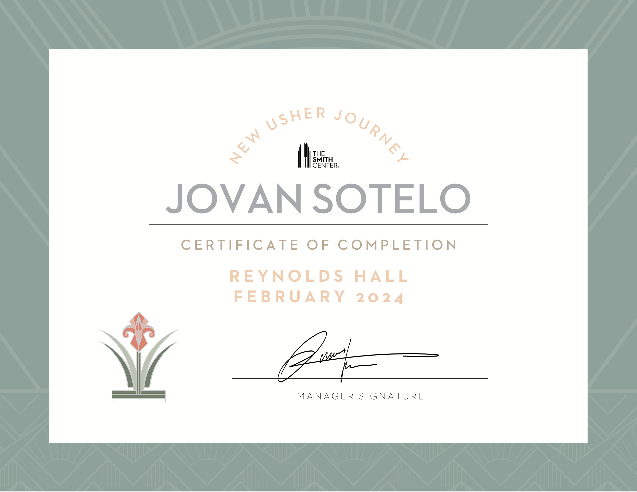
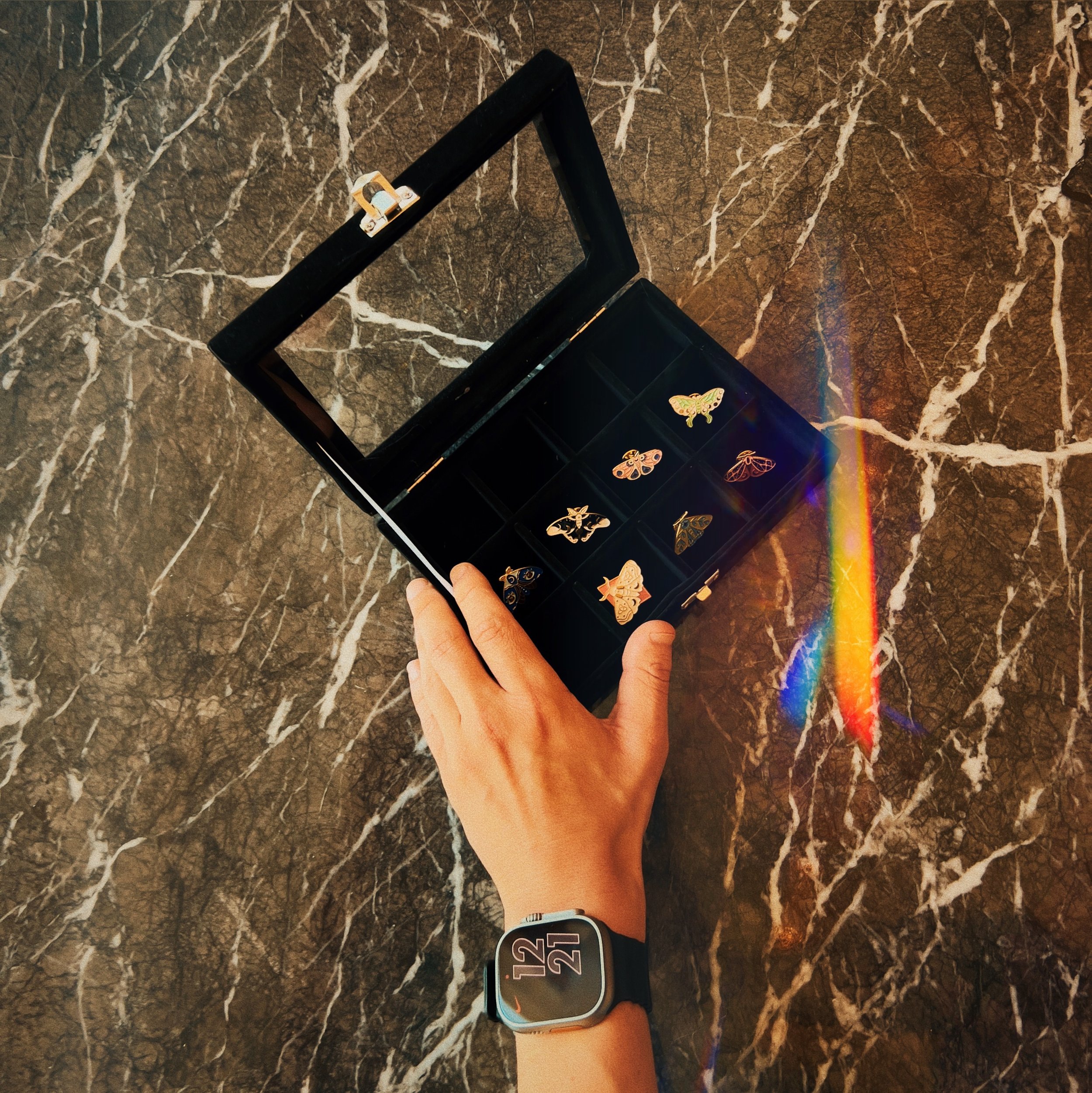
Upon Completion, the new hire would get a specialty pin symbolizing their epic journey, alongside a certificate of completion and a photoshoot done by yours truly.
A paradigm shift unlike any other. Not only did we find a successful solution to our problem, we created an engaging experience for the team.
Now every time someone completes their new hire journey it is an honor and an event that we all celebrate.
training reimagined
What was once a cumbersome stack of papers has been transformed into a sleek and captivating presentation. Inspired by Apple’s design principles, but using our brand guidelines, I developed a brand new training presentation that has received unanimous praise. The presentation is not only visually stunning but also engaging and effective. It includes assessments to ensure new hires are retaining information, elevating our training program from standard company fare to an industry-leading experience.
Engaging and Informative.
“Good design isn’t something you see, it’s something you feel.”
feeling seen feeling heard
volunteer engagement
The Smith Center is a non-profit so we run on a duel system of Paid staff and Volunteers for our Usher Staff. One of the pain points I wanted to address with the volunteers was that some Volunteers wanted to work a shorter shift as opposed to the regular four hour one.
So in building the Volunteer Management System, I chose to address this pain point by creating to different shifts. One 2 Hour Shift, and One 4 Hour Shift. That way volunteers can pick and choose which shift works better for them and their schedule.
This change was a rapid success, and nightly we’ll have all spots filled for both shift types. So not only did we address the needs of the business, but also, and most importantly, the needs of our most crucial team members.
asking the right questions
The next thing to tackle was the hiring process for New Ushers. Using the knowledge I gained from previous usher and management feedback, as well as personal management experiences I implemented system’s thinking into the interview process. With the data I gathered, I came up with a list of key questions that could be used not only ensure the hiree is the right fit for the company, but that we are a right fit for them.
The key to any successful endeavor starts at the core, and when you get to know people on a deeper level, you can ensure that you are gathering what you need to build a successful future for your team and for the company itself.
improving management systems
Through my research, I gathered that one of the biggest pain points the supervisors and management faced was information and key components of their daily workflow being scattered across not only various systems, but different rooms within the venue and even different computers.
My vision, was to create a place where all of this information could live and allow the windows of productivity and collaboration to flourish. This was a grand idea, but without the budget in place for an app to be developed, I did the next best thing. I created a system using google workspace. After about 2 months of data entry, sheet scanning, user testing and iteration, I developed a user system that is shared amongst the team that is easy to use, customizable, quick and readily accessible for up to the minute updates. The aptly named, “TM Guide” capitulated us into a new state of being, where work flows harmoniously from task to task.
No more running to the second floor to get information from the filing cabinets, no more clicking through endless excel and word documents, no more looking the copious amounts of emails to find information. No more. A system built out of necessity, the longing for something better, the need to grow. After launching the system, productivity skyrocketed, the team began hitting deadlines early, began to work on projects long overdue, and most importantly, the stress of trying to find something, an answer, a question, was gone.
In addition to the TM guide, I developed a new system for employee placement. Every night before the show begins, we would print out a placement for all of our team to know where they will be placed for the evening. This was a great tool, however we found that we were always having to make last minute changes to the placement sheet. So you would find the management team often having to make changes, print out multiple sheets to deliver them to several key areas of the theater, then advise each other of the changes.
It was at this moment I remembered how the creation of the first webcam began. A group of scientists were tired of not knowing if the coffee machine in the other office was low, so they developed a system that would allow them to see if the coffee machine in the other room was full. The rest is history, and now we all have one of the most influential tools of the modern age. The Webcam.
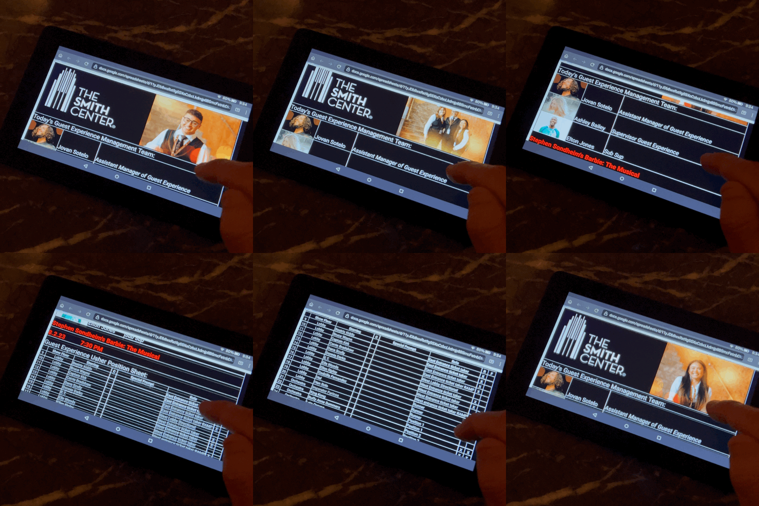
I know it’s funny because I didn’t do anything that grand, but it is in this instance that you can see how often i’m channeling my inspirations. This was one of those moments, and born out of that need, was the “Usher Position Sheet”. Using UI/UX principals, I created a digital version of the position sheet that could be accessed using an old Kindle that I retrofitted for this purpose. Now any changes that occur on the spot, the manager on duty can make the change via phone or computer and it get’s instantly updated across all our systems throughout the property. Now everyone knows where they’re going to be without a doubt.
But I didn’t want to just make simple text to digital transfer of information, it had to expand upon the idea, and it had to look good too. Using Jakob’s Ten Usability Heuristics, came into play heavily. Specifically Match between system and the real world, User Control and Freedom, Consistency and Standards and Flexibility and ease of Use.
So with the new system built, now the ushers can not only interact with a digital touch system, they are able to see who their manager is for the evening (something they previously wouldn’t know until the very start of their shift), alongside a revolving slideshow of team members that recently graduated their new hire Journey. A splendor to behold, and it harkens back to what I said earlier in regards to making sure people feel seen and heard. It is with small gestures like these, that you make it happen.
The Trojan Room coffee pot at the University of Cambridge - 1993
Old Usher Position Sheet
New Usher Position Sheet
improving the guest experience
Another feature created to exist within the TM Guide was a guest experience audience tracker. With it, we would able to see audience scores on shows, comments on our team, and ways we could improve the overall guest experience. Since it’s inception, it has proved to be an influential tool on helping us reach the next level of guest satisfaction.
User testing
Throughout the creation of the TM Guide, I worked with my team of supervisors and manager to find what works best for all of us. This took shape primarily through Monitored usability tests.
I asked my colleagues to complete specific tasks.
I monitored usability along with the emotional journey that they went through while attempting to complete these tasks.
TUTORIAL
TUTORIAL
Wireframes
Even though this project is different from the standard app development, I still employed the use of low fidelity wireframes to help me visualize what the final system would like.
low fidelity
high fidelity
final results
I identified patterns that caused Ushers and Management to become frustrated
I took on their multiple pain points and developed solutions for them.
I solicited user feedback to improve on further iterations.
Productivity, team building, and team member retention all saw a significant improvement leading to a more immersive and engaging experience for all.
final thoughts
So you might’ve asked yourself at the beginning of your Journey with me, “Why does this guest experience manager want to Pivot to UI/UX?” For that, the answer is simple. At the core of it all, one thing remains true. The need to help others achieve their goals. In this journey of life I’ve often wondered what is the purpose of it all. Through everything, I’ve come to realize that I was put on this earth and given these tactile skills to help others and I was made an artist, to heal. Sometimes those two worlds meet, and sometimes they’re explored individually. This duality, is the core of my being. To help, to heal, to wonder, to dream.
X


